


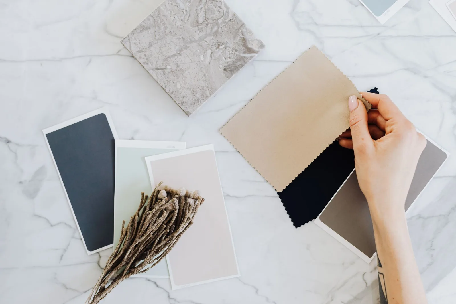
Defaulting to black is not a failure of imagination. It works: everything matches, the silhouette stays clean, and you never have to think in the morning.
The problem shows up later. A wardrobe of one color has no range — every outfit reads the same, and the pieces stop being distinguishable from each other. At that point people usually try to fix it by buying something bright, wearing it once, and returning to black.
The fix is structure, not courage.
Three tiers
Sort every color decision into one of three roles.
Base (60% of the wardrobe). The color most of your garments are. Trousers, outerwear, the bulk of your tops. This is where black usually already sits, and it can stay there.
Secondary (30%). One or two additional neutrals that work with the base and with each other. This is the tier most all-black wardrobes are missing entirely, and it is the one that actually creates variety.
Accent (10%). Color proper. One piece at a time, usually small.
The mistake almost everyone makes is skipping the secondary tier and jumping from base straight to accent. That is why the bright piece feels like a costume — it has nothing to sit against.
Building the secondary tier
Secondary neutrals for a black base, roughly in order of how easy they are to wear:
- Charcoal and mid-grey. Nearly invisible as a change, which is the point. Grey with black looks deliberate in a way black with black does not.
- Cream and off-white. The highest-contrast neutral. One cream piece against black changes an outfit completely.
- Oatmeal, sand, taupe. Warmer, softer contrast than cream. Very forgiving.
- Navy. Works with black despite the old rule against it, provided the contrast is clear rather than marginal. Navy and black in adjacent shades looks like a mistake; navy and black in obviously different values looks intentional.
- Olive and khaki. Function as neutrals in practice, and both sit well with black.
- Brown. The most underused. Chocolate and tobacco with black reads considered and slightly unexpected.
Pick two. Not five. Two secondary neutrals plus a black base already produces far more combinations than an all-black wardrobe, and every one of them works by default.
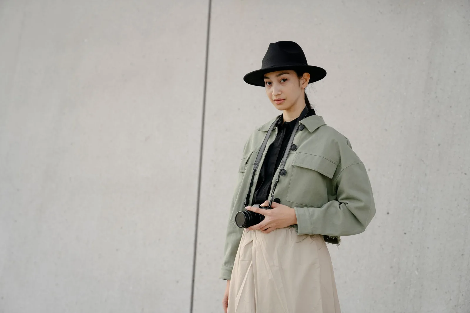
Where the accent goes
The accent tier is one piece per outfit, and generally a small one.
Reliable placements: a cap, a bag, socks, a scarf, the shoe, or a tee worn under an open jacket so only a section of it shows.
Harder placements: trousers, outerwear. These are large surfaces, and a large surface of a strong color needs the rest of the outfit to be very settled.
The practical test: if you removed the accent piece, would the outfit still work? If yes, the accent is doing what it should. If the outfit falls apart without it, the accent is carrying too much.
Undertone, briefly
This is where color advice usually turns into a personality quiz. The useful version is short.
Colors lean warm (yellow-based) or cool (blue-based). Cream is warm; pure white is cool. Chocolate brown is warm; charcoal is cool. Olive is warm; navy is cool.
Mixing warm and cool is not forbidden, but it is noticeably harder to make look intentional, especially with two neutrals in similar values. Two warm neutrals or two cool neutrals will almost always sit together comfortably.
Black is effectively neutral on this axis and works with both, which is a large part of why it is such a convenient base.
If you want a single rule: keep your two secondary neutrals on the same side. Cream and tan together, or grey and navy together. Cream with grey is where things start to look slightly off without anyone being able to say why.
Texture does the same work as color
An overlooked route to variety, and the one that suits people who genuinely do not want color.
An all-black outfit in one fabric is flat. An all-black outfit combining a heavy cotton, a smooth woven trouser, and a matte leather reads as considered, because the light hits each surface differently. You have created contrast without introducing a second color.
This is the strategy underneath most all-black wardrobes that look expensive rather than lazy. The variation is there, it is just in surface rather than hue.
Fabric weight participates in this too, since a heavy fabric holds shape and a light one drapes, which changes the outfit's outline as well as its texture — the difference between drape and structure is worth understanding on its own terms.
Black is not one color
Worth knowing if you are going to build on a black base: blacks differ, and they differ visibly when placed next to each other.
Cotton takes dye differently than polyester, so a cotton black and a synthetic black in the same outfit often read as two slightly different colors under daylight. Black also fades with washing and sun, drifting toward grey or, on some dyes, faintly brown or blue.
None of that is a problem when the pieces are separated by other garments. It becomes noticeable when two blacks are directly adjacent — a black jacket over a black tee, black trousers with a black belt.
Two ways to handle it:
- Separate the blacks with a secondary neutral so they never touch.
- Lean into the difference by making it obviously deliberate, usually through texture. A matte black against a sheeny black looks intentional. Two matte blacks in marginally different shades looks like laundry.
This is the same principle as the near-miss problem below, and it is the most common reason an all-black outfit looks slightly off in photographs when it looked fine in the mirror.
Building it in order
If you are starting from an all-black wardrobe and want to change that without a large purchase:
- Add one cream or off-white top. Highest impact per item. It will go with everything you own. A plain midweight tee in a second color is the lowest-risk version of this.
- Add one warm neutral bottom — olive, tan, or brown. Now you have outfits that are not black-on-black.
- Add one textured black piece that is obviously a different surface from what you have.
- Only then add an accent color, and buy it small.
That is four purchases, and it takes a monochrome wardrobe to something with genuine range. Doing it in that order matters, because each step makes the next one easier to place.
The failure modes
- Too many accents. Two strong colors in one outfit is usually one too many.
- Adjacent-but-not-matching neutrals. Two blacks that are slightly different blacks, or a near-navy against a navy. If two pieces are almost the same color, the eye reads it as a mismatch rather than a choice. Either match properly or contrast clearly.
- Buying an accent color with no home. A bright piece that goes with exactly one other thing you own is a piece you will not wear.
- Ignoring the shoe. Footwear is a large block of color at the bottom of every outfit and gets treated as an afterthought, which is worth planning as deliberately as the rest.
None of this requires giving up black. It requires black to be a decision rather than the only option, which is a different wardrobe with roughly the same contents.